Multi-brand Design Systems. Life made easy.
In the world of Figma and Design, things change at a rapid pace. To keep up, we as designers are required to stay curious and continue to learn the latest tricks and trends of the trade.
This is exactly what I did when I was tasked with creating a Design System that can be utilised across multiple brands. Since Design Systems was something that I knew a little about, I hopped onto Google and started my research. When the research started for this project, I wanted to make sure that we include and collaborate with the developers as well, as this would be something that they could also benefit from.
If you're a UX designer, you will know what I am talking about when I say things like ‘Design Systems’, ‘Design Tokens’, and ‘Variables’. I was not too familiar with these terms, as Design Systems was not something I specialized in, so I first wanted to make sure that I have a comprehensive understanding of what a Design System is, before tackling the task of creating one that multiple brands can benefit from.
Design Systems
This is what I have learned about Design Systems:
To quote Osama Eldrieny: a design system is a set of guidelines and patterns used to create a consistent visual language across a product or organization, which helps improve communication and user experience. (Eldrieny, 2023). In a nutshell, Design Systems are the puzzle pieces we use to design products with. These components are predefined with values for text styles, colour styles, spacing, corner radius, etc. By having a comprehensive design system, it allows us to create volumes of designs in less time it would take if the system was not in place at all.
Design Tokens
Now that I knew what a Design system is, it was clear that, for us to have an effective product, we need to understand the fairly new Figma feature that allows you to create design tokens and variables.
Here is what I have learned around Design Tokens:
Design Tokens are a method for managing design properties and values across a design system. Each token stores information such as colour, sizing, spacing, font and animations to make it easier to refer to. Each token also has to get a name. These tokens are implemented across all of the designs and becomes a source of truth and shared language between Design & Code. These tokens help maintain consistency, improves the management of a scaling design system and removes the guesswork and possible confusion when building products. Using tokens means that updating designs and design systems become faster and more efficient.
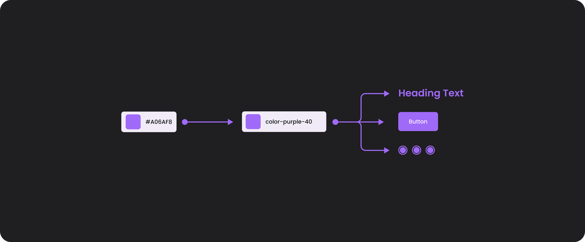
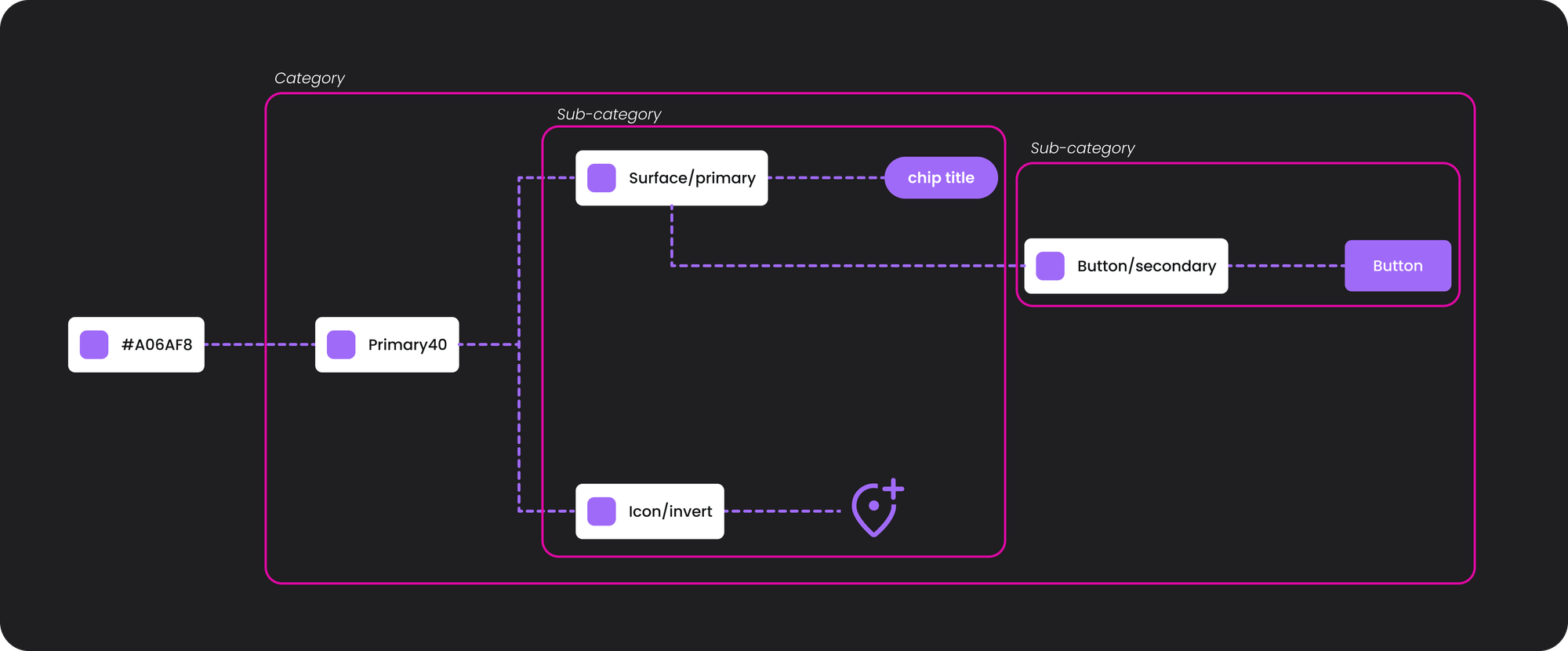
The most common structure of design tokens starts with the foundation of values known as primitive tokens, then you build on top of the primitive tokens with semantic tokens and lastly, you build on top of semantic tokens with values that are then called component-specific tokens. Each type communicates a what, how and where about the token:
- Primitive tokens: tell us what properties and values exist within our designs. They define every value in a property’s system, but they are reference only. They are the foundation that other tokens are built on and are never directly applied into the designs.
- Semantic tokens: can be applied to design, it gives us context on how the token should be used.
- Component-specific tokens: which provide more specificity as to where a token is used. These are used directly in the design.
Aliasing allows any token to reference or take on the value of another token. If a token changes then any token that referencing it will update as well. Aliasing allows you to neatly organize tokens into categories, sub categories and so on. The categories communicate how the token is used. If the tokens are set up correctly, they would be able to quickly update any category and all associated tokens downstream will update without unintentionally affecting others (Figma, 2023).
Design Systems for Multiple Brands
After learning all about this, and having a much clearer understanding of how to create Design Systems efficiently, I started research on building Design Systems that can be used across multiple brands. From my understanding with all the reading about multiple companies such as Spotify, Virna Valera and various other sources, it seems that they all faced a similar type of challenge and had more or less the same view on solving it.
The approach they took looked like this. Almost all of these brand referenced the Atomic Design process, which seems to be helpful in providing a basic structure that allowed them to visualize the UI elements from the smallest to the largest part. Virna Valera for instance used Design Tokens to build foundational styles, then build components; from there they broke it out into team components and core components, which branches out to templates, and then lastly you get the pages you need.
The idea is to build global tokens and brand tokens to establish a good foundation. From these tokens, each brand could use it and stylize it by adjusting the colours, border-radius, and so on. This is what we sought out to do as well: to have global and brand tokens and from there branch out into specific brand-related designs. I could go on to explain how they further structured their Figma filing, etc. But I would rather share the link to the article that you can read further on.
Our Approach
Having learned the specifics of a Design Systems and how to approach building a comprehensive Design System, I sought out to have a small team of 'Design System Custodians' to help me on this journey of building a system that caters to multiple brands. Having this knowledge also allowed me to approach the developers, pitch the idea and get them onboard and aligned to what we are trying to achieve.
Why am I involving the developers? Collaborating with developers allows for consistency from design to code, and allows alignment of the naming conventions of Tokens (Design) and the Contracts (Development). Having systematic naming that aligns across design and development allows for less QA time, having one source of truth, seamless handover to the developers, and saving time for the team overall.
Building a comprehensive design system like this is something that we are still continuously working on, so for my team, it's still an ongoing process.
Sources:
- Tokens, variables and styles: Update - Intro to design systems. 2023. Available from: https://www.youtube.com/watch?v=JyCmacSyDY4. [16 October 2023].
- UXPin. 2023. Multi-brand design system - How to get started. 05 October 2023. Available from: https://www.uxpin.com/studio/blog/multi-brand-design-system/. [16 October 2023].
- Superlógica. 2022. Structuring a multi-brand design system. 2022. Available from: https://www.virnavarela.com/projects/structuring-a-multi-brand-design-system. [16 October 2023].
- Hupe, A. 2021. Building a Multi-brand design system. 08 February 2021. Available from: https://medium.com/bts-design-team/building-a-multi-brand-design-system-79469d425bf3. [16 October 2023].
- Kaiser, G, Posniak, M, Bent, S. 202o. Reimagining Design Systems at Spotify. September 2020. Available from: https://spotify.design/article/reimagining-design-systems-at-spotify [16 October 2023].
- Figma tutorial: Intro to Variables. date. Available from: https://www.youtube.com/watch?v=1ONxxlJnvdM. [16 October 2023].
- Beginner's guide to design tokens - basics for design systems!. 2023. Available from: https://www.youtube.com/watch?v=1-pkJSDskvY. [16 October 2023].